Traffic Incident
Online Reporting System
In Canada, people have to report traffic accidents within a tight 24-hour deadline, leaving them little time to process the accident, gather the right information, and get to the police station. TIORS is an app that makes the reporting process less daunting: It facilitates accident-reporting in an accessible, multi-language online format, giving people the time, space, and calm they need to properly report their accidents.
TIMELINE
8 Weeks Solo Project
MY ROLE
Experience Strategy, Visual Design, Branding, Interaction Design
DELIVERIABLES
UX Research, Experience Maps, User Flow, UX Wireframe, Interactive Prototype, Visual Design, and Usability Testing
Why TIORS?
Traffic incidents become more and more common these days during rush hours and freezing conditions. According to Canada’s law, people are required to make a police report about the accident to the nearest collision center within 24 hours of the accident. Moreover, the reporting information form may cause confusion and misunderstanding for people, especially for non-English speakers
To solve the pain points of the current traffic accident reporting system which may include but are not limited to the language barrier, time restrictions and the connection with the insurance companies, brand new TIORS came out with multi-language. Moreover, this system will be connected to the related insurance companies, which will accelerate the insurance claim process.
00
Create User Interviews
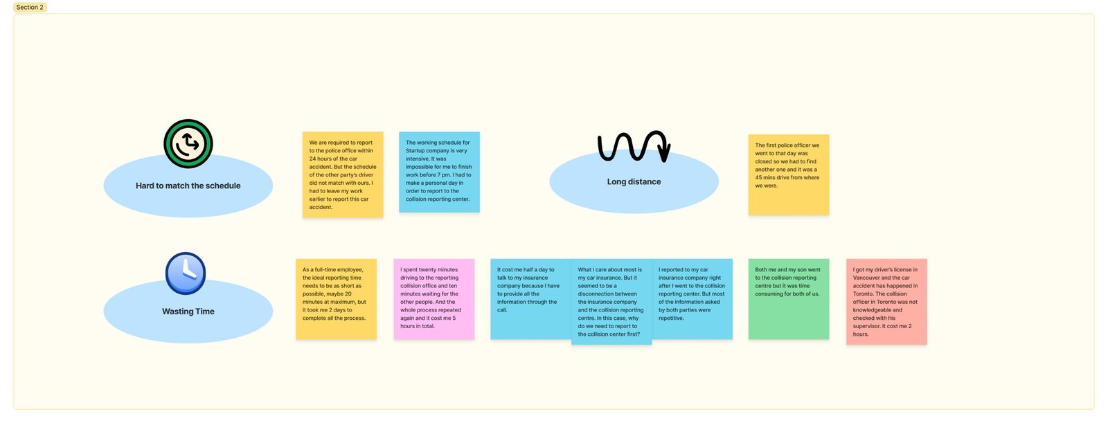
In order to find an ideal solution for the traffic reporting system, initially, I studied with 5 individuals with a survey below.
Interviews are particularly useful for understanding the story behind a participant’s experience. As an interviewer, I can get a deep understanding of the subject. In order to achieve the most valuable results, the respondents chose the following basis/criteria:
1.
Newcomers to Canada whose first language is not English
2.
People who are at work and had experienced traffic incident reporting in Canada
3.
Travelers who have problems in reporting traffic incident


01
Synthesizing The Research
Following JTBD map states user’ pain point and expectation from using the app.
Job Performer (Who):
Anyone who experiences a traffic incident and needs to report it
Jobs(What):
Main Job:
- Report the traffic incident
Related Jobs:
- Reimburse car insurances
- Save reporting time
Emotional Job:
- Being able to report more comfortably and easily
Social Job:
- Report the car incident by their own
Needs(Why):
- Decrease the time of the whole traffic incident process
- Link the information of both the car incident and the insurance company while reporting
- Reduce the limitation of the car accident reporting process
- Maximize the efficiency and accuracy of reporting car accident
Circumstances
(When/Where):
- When people experiencing language barrier
- When people don’t have time to visit the collision reporting center
- When people are confused about the whole traffic incident reporting process
- When people feel it’s inconvenient to contact the other parties’ of the accident and schedule a time to visit the collision report center together
02
Information Architecture
From the interview and survey findings, I found that TIORS has to be a traffic reporting system in Canada which has all these features:
Multilingual (English/French/Chinese/Korean)
Shared information with insurance companies
Accurate and clear instructions & reporting questions

On top of that, I test and take into consideration all the ways users could navigate through a site or app to identify the essential path and summarize them into a user flow map.

03
Sketching & Usability Testing
Once I got an understanding of the users, their task and stories, I started sketching design solutions. The process of sketching enables me to visualize different ideas and try out content placement.
04
Wireframing
In order to define the hierarchy of the elements that make up the product, which will, in turn, help me determine the layout of your product, I carried out the following wireframing:
05
Design Systems & Brand Platforms
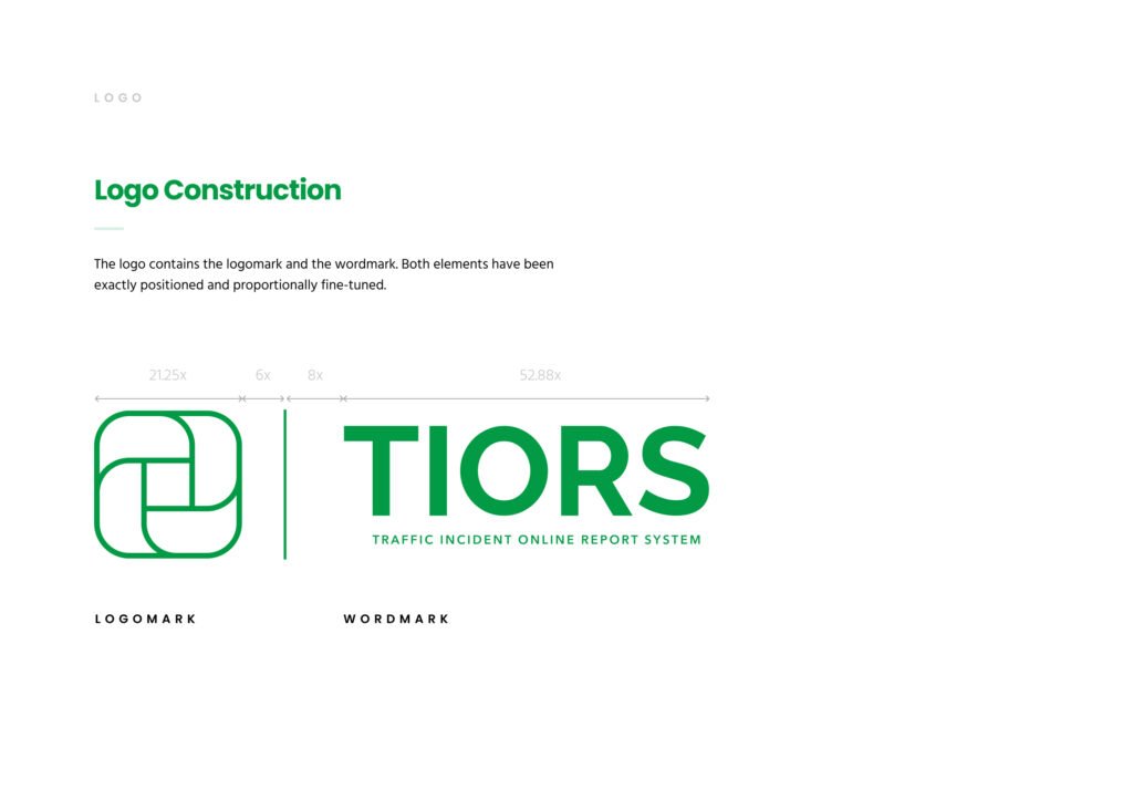
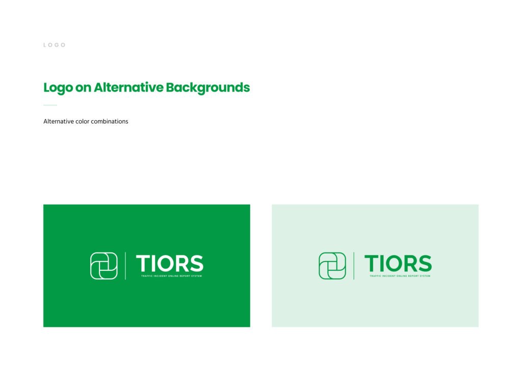
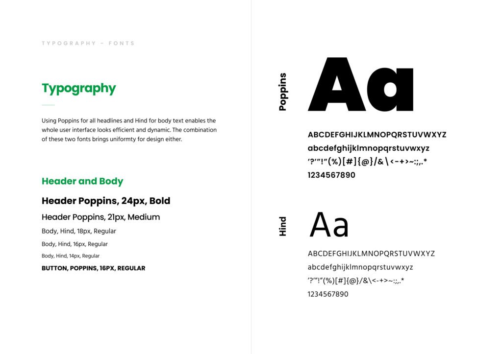
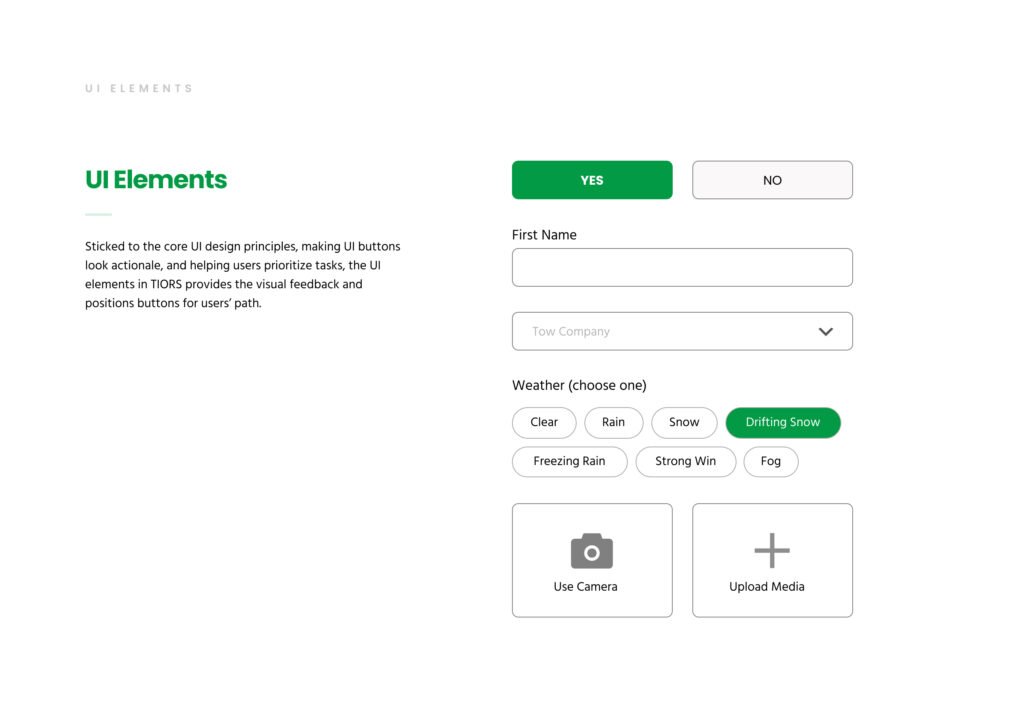
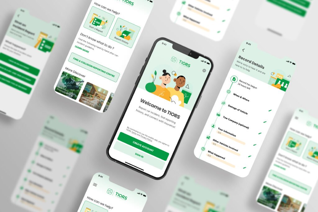
I choose green as a color palette as it balances our emotions and leaves us feeling safe and secure. It also stands for helpful and efficient. Also, for the logo, the four-rectangle section represents the government, insurance company, the third party of the car accident and the users. The center square unifies four parties together, which also stands for the spirit of TIORS. And for the brand personality, it has an inspiring purpose that goes beyond incident reporting and makes a real difference in the social and technological revolution. And for the brand attributes, secure, helpful, simple, professional, and revolutionary. Because when anything is related to police and insurance, the priority is secure. When a product conveys a sense of helpful, simple, and professional, people are more likely to be willing to use it. With increasing people shifting their reporting from in-person to online, this product must be revolutionary.


06
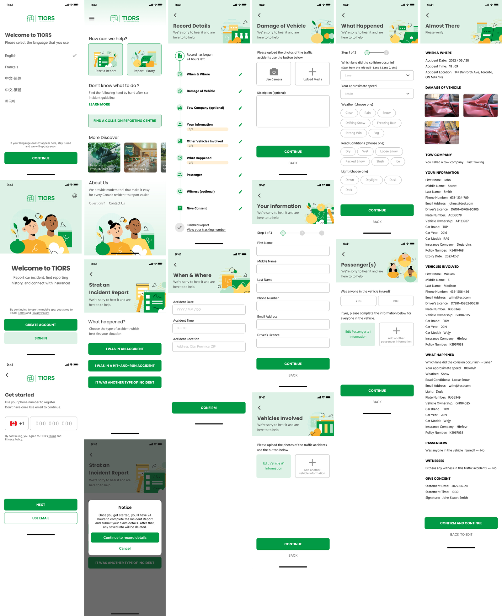
High Fidelity Mockups
07
Testing
Key Findings:
1.
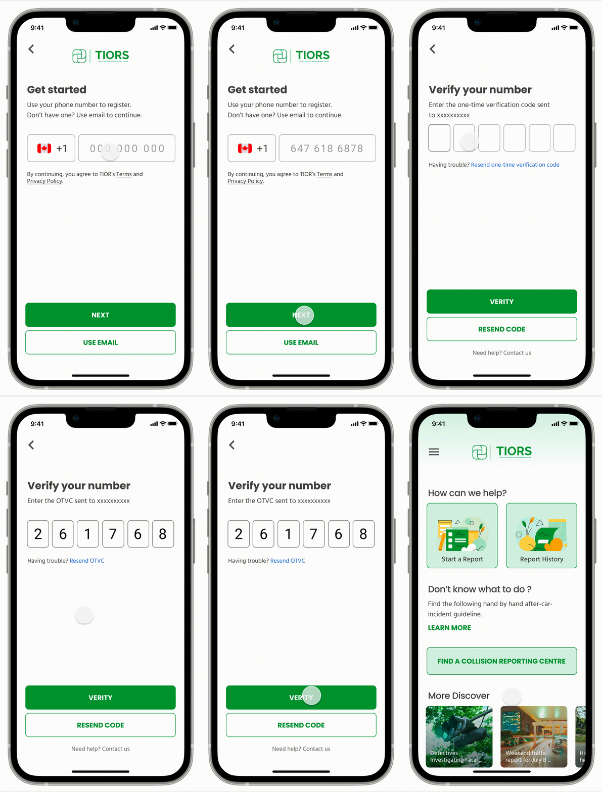
Users is concerned about the verification page, and what “OTVC” means
2.
There are so many questions that need to be answered
3.
Users preferred to track the reporting process after submitted the request
Testing x1 x2 x3…
Following is some of the critical findings from conducting user testing and how I have made changes based on those insights. After changes were made, they were validated by testing more users.
08
Solutions
I wanted to design a secure and efficient online reporting platform that facilitates online traffic accident reporting in Canada, which includes multi-language, connection with insurance companies, and e-reporting system.
A clearer expression
Instead of using the abbreviation of OTVC, a full-term “one-time verification code” is applied to the new version to better illustrate the function of this page. Users are more likely to understand what they expect to do with the new version.
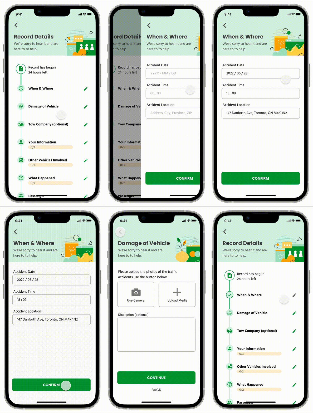
Save and continue to work function
As an official online reporting platform, there is much information in the questionnaire. Instead of reporting all the information at once, users can choose to report anytime, and the system will save the information and users do not need to report from the beginning.
Connection with Insurance Company
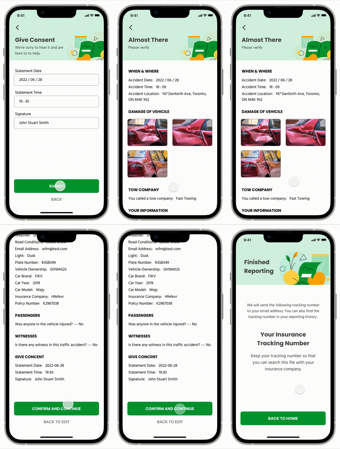
With the connection with the insurance company, users do not need to report the traffic again. And users are able to track insurance information with the tracking number generated by the app.
09
Summary
I want to make TIORS accessible to all users whose primary source of reporting is at the collision police office.
In engaging ourselves with an in-depth and well fleshed out process, I created a seamless, quick content browsing and consumption experience while providing a customised sharing and organized saving system. Not only was I able to touch upon some basic user research, we were also able to take the project to an early prototyping stage, giving me a chance to not only work in a group setting, but also across a large span of the design process.
From the early ideation stage, to talking to potential users, TIORS was a successful project in more ways than just a completed mobile experience.