PostUp >>>
5 days design sprint challenge
PostUp is a new startup where freelancers and remote workers share tips and advice. Recently, PostUp has seen lots of feedback and discussions about how to find good public places to work from. PostUp wants to make it easier for remote workers to find great public places to work from.
Goal
Help Remote-freelancers find quality places to work, no matter where they are
Timeline
5 Days Design Sprint
My Role
UX Research, UX Design, Wireframes Maker, Stitcher
Clients
PostUp
Day 1 - Map
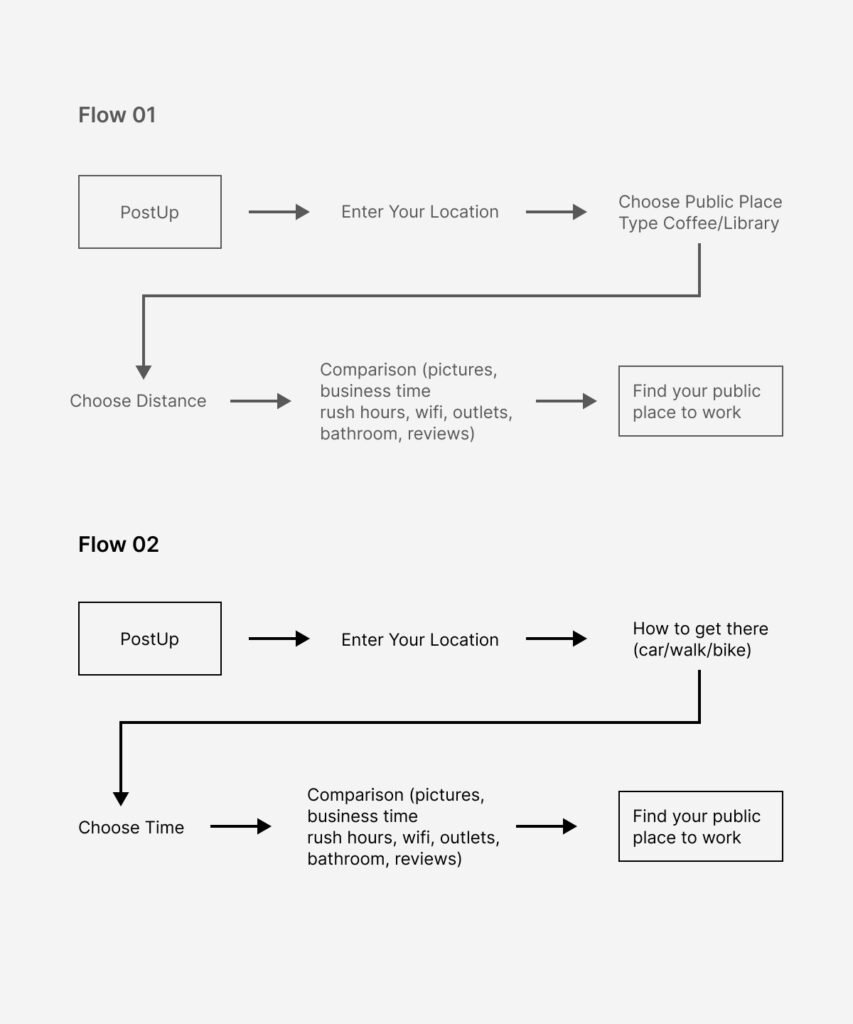
PostUp is aimed to create a mobile app for remote workers to search for suitable places to work from, as it will provide the most convenience for workers to find the nearest place to work. Moreover, a monthly fee of $5.99 will be charged for users to exchange for access to Postup information.
To better illustrate my design idea, the map of the possible end-to-end users experience is shown accordingly

Day 2 - Sketch
To get inspired, I did some research regarding google map’s nearby feature. When people searched nearby coffee shops, not only the distance, but also the rating and pictures are shown very clearly, which also largely help users find the ideal coffee shop.


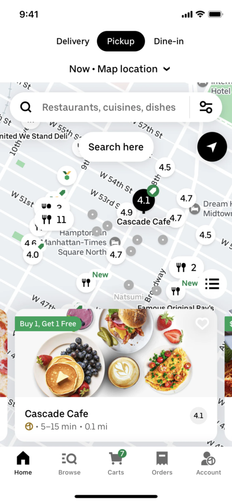
Moreover, when I did the research on Uber Eats, the filter function inspired me a lot. Users can choose their preferences such as free wifi and free outlets, and also the distance from them. The location function also simplifies the user’s experience, they don’t need to manually enter their address but with only one click, the system itself can identify the user’s location.
-
I designed eight versions of the most important screen. Some versions demonstrate each coffee shop’s general information such as the rating, distance, and expense. Some focus on the filter function which allows users to choose the best coffee shop. Another version emphasizes the coffee shop’s pictures and surroundings, which enables users to “visually” pick up the place to work.

After that, I selected the most critical screen for the crazy 8s. The reason behind that is that the screen contains the most important information that users want to gather: the filter elements, the search results(the most nearby coffee shop), and the distance between each of them.

Day 3 - Decide
I choose to proceed with this solution because it is the screen that contains most information including the picture of the coffee shops’ environment, the coffee shops’ tags (wifi free, rating, quietness), and the distance from the current location & all the available coffee shops. Some of the other screens show a limited number of coffee shops, and the other one may not show the full view of the coffee shop pictures.

Day 4 — Prototype
As shown on the prototype screen, when users enter their address, they will be able to find the customer reviews, pictures and some tags (free wifi/outlets availability/cleaness of the bathroom). Also, when there are several available options, users can also use the comparison option to find the most suitable coffee shop for them.
Day 5 - Test
I conducted the user testing with 5 participants to better understand how real users interacted with the prototype in order to make improvements to the solution. Users were found through my social media posting friends’ connection.
Users were asked to test the prototype and answered 8 questions during their testing. It was conducted via zoom. Questions were mainly focused on: whether they were able to use the system fluently; and users’ suggestions for the prototype.
Through user testing, we were able to verify that our prototype achieved majority of our initial sprint goals:
Providing accurate solutions to users’ pain point:
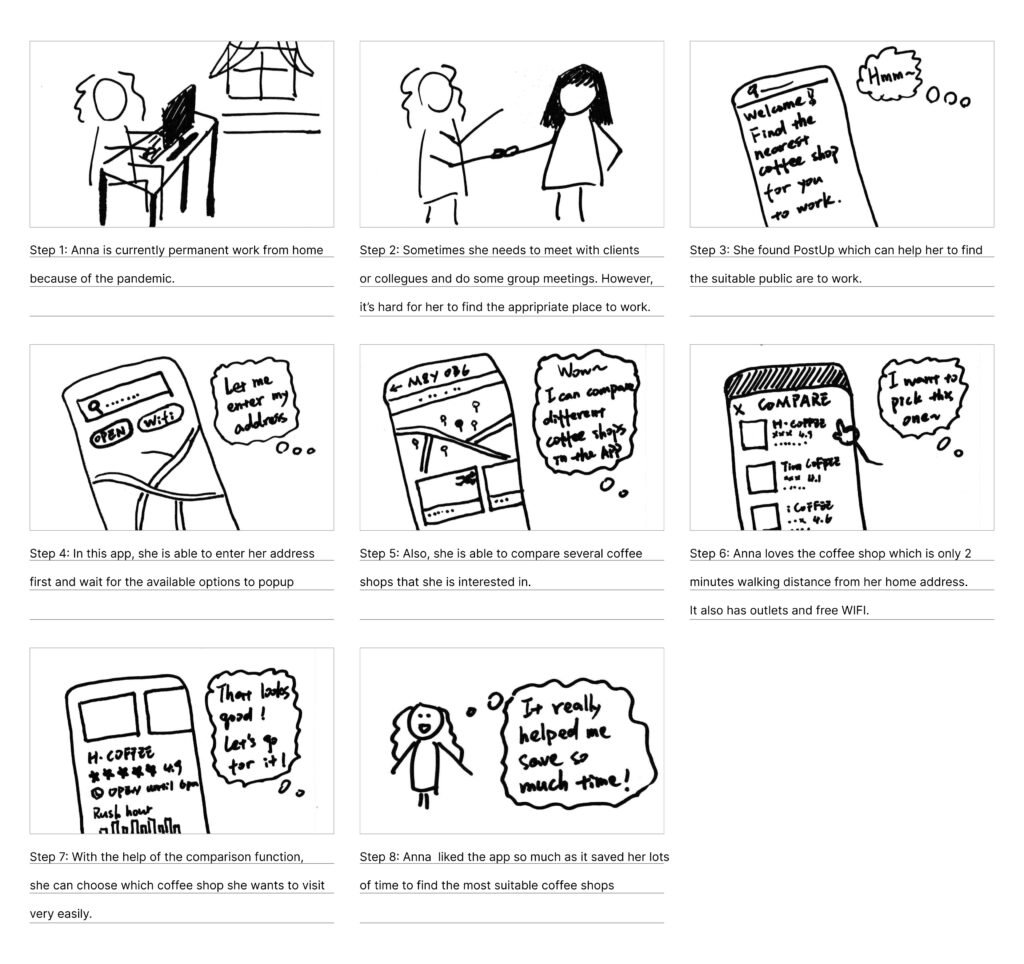
Users felt being able to use the prototype to explore and find the most appropriate shop for them, which exactly fits their needs to find a place to meet clients/have group meetings while they are work from home.
Being able to search and compare:
Users understood from a strong walkthrough why and how they can find the most suitable coffee shops for themselves. With the comparison function, users are able to compare different coffee shops by distance/rating/and adaptability (outlets/free WIFI/bathroom cleanliness etc).
It was apparent however, that there were minor issues to resolve to ensure usability:
Comparison Function:
The indicator of the comparison function may not be straightforward for some of the users. It’s better to use a more understandable signal to represent the comparison function.
Detailed Workspace Information:
For the coffee shop/potential workspace information, some of those can be more detailed. For example, the availability of outlets, cleanliness of washrooms and whether it have free wifi can be included.
Final Prototype
Reflection and Learning
Further Iterations: We would like to make further iterations of the core value that connects the user to other potential users and how to further present the comparison function more straightforwardly.
Challenge: Our biggest challenge going into this was the time constraint and learning to think fast on our feet. I would have loved to be able to explore more regarding the comparison feature. In my next steps, I would like to further test the next version, especially the comparison feature to flush out possible usability issues.