
This project was developed at Springboard as part of the industry research component of the course. The brief was to enhance an eCommerce website browsing and checkout experience to greatly improve their product’s usability.
Timeline
2 Weeks Solo
My Role
User Interface Designer. User Experience Researcher. Experience Strategy Specialist. Problem Solver.
Deliverables
Solution, Low-Fidelity Flows, Prototypes, Product Mockups, High-Fidelity Flows
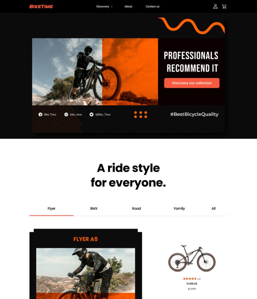
- Brand Identity Design
Given the e-commerce scenario, I came up with the whole package brand design. As for Bike Time, I choose orange, black, and white as the color palette to demonstrate the energetic, fair, and reliable branding.

- Industry Research
As to better understand the website flow and website design, I use secondary research, competitive research and user interviews to identify potential users and find solutions to improve users’ call to action rate with demonstrating product feature.
Findings from Secondary Research
- According to An Analysis of Factors Affecting on Online Shopping Behavior of Consumers (2012), Jephuneh.E stated that the risk of losing money and financial details will have a negative effect on attitude toward online shopping. Moreover, the product risk will have a negative effect on attitudes towards online shopping (p.88).
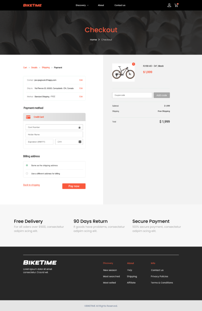
- In this case, in order to increase the conversion rate and increase the likelihood for users who have placed an item to purchase, detailed delivery timeframe and the return policy need to be contained in this page. With the help of those two pieces of information, users are less likely to have the risk of losing money and will have a clearer picture of financial details.
Findings from Competitors Research
- For the competitive research, I take a look at https://www.bikedepot.com/, https://moeve-bikes.de/,https://www.radpowerbikes.com/, which is the top three bikes website.
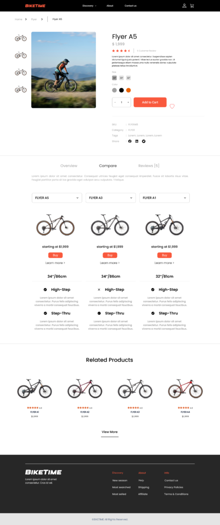
- If adding ratings for each bike, users are more likely to figure out which bike is worth buying while they are browsing on the home page.
- With the comparison features, users will be tendable to find the bike which is suitable for them. Moreover, user’ review will help make the products look reliable and vivid.
Findings from User Interviews
- Easier to find bikes under specific categories
- Some of them suggested that they will need a detailed delivery timeframe to get them “willing to add the product”
- Some of the users prefer to have a guest checkout page because they don’t want to register for the membership and receive marketing emails
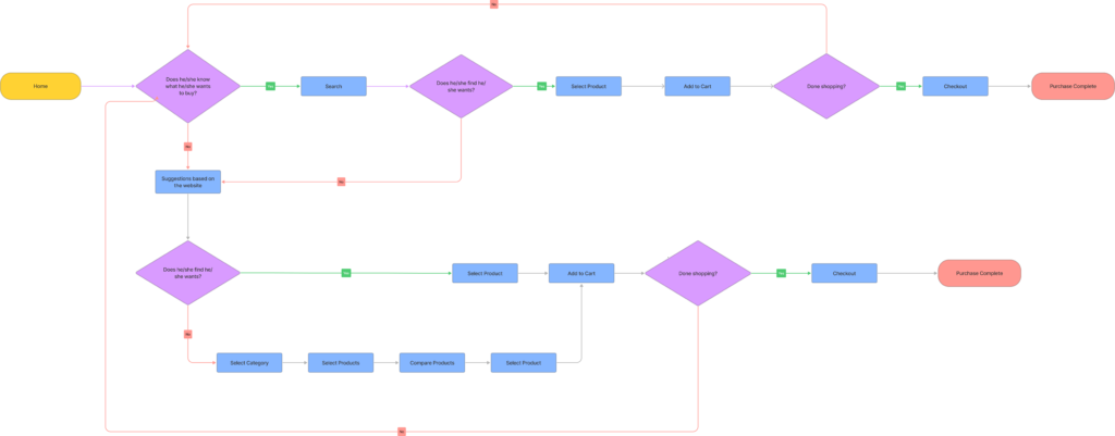
User Flow
Based on the user flow which includes shopping flow and checkout flow showing above, I elaborate on the low fidelity design which is illustrated below:
Shopping Flow
Checkout Flow

- Low Fidelity Testing
For the first round of low-fidelity test for Bike Time, I interviewed three people that fit into the app’s target demographics: two men and one woman, average net income is $100, 000.00 and all of them love riding bikes. All of the interviews were conducted remotely. Each interview lasted about 30 minutes.

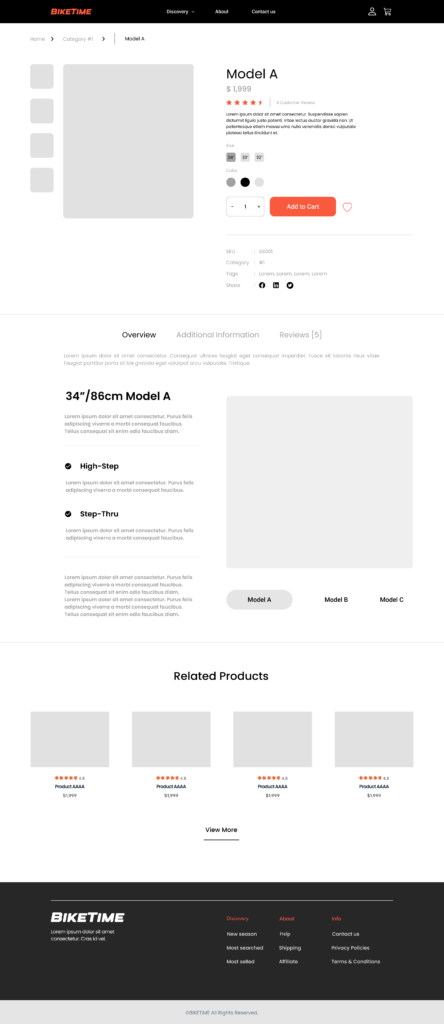
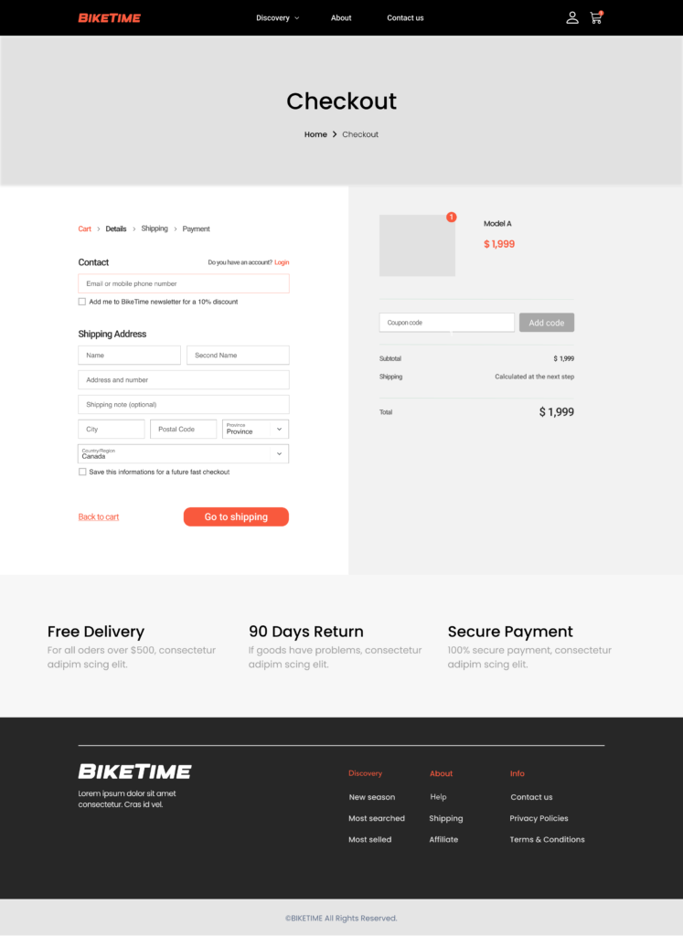
Here is the interview finding:
- Adding the product’s color and size before letting users enter the card information, which users will be more comfortable to checkout as they have confirmed their product
- It will be more helpful to add “top sales”/”good rating” sub-tab, which will help them to find the most popular bike more easily
- It’s more logical to add “all bikes” on top of the four categories. On top of that, some users think it would be much more clear if they added an adjective right after the category, for example, light/good-looking etc
- It’s better to switch the product information and checkout information in the checkout page
- High Fidelity Testing
Based on the low fidelity results, I worked on the high fidelity showing below:

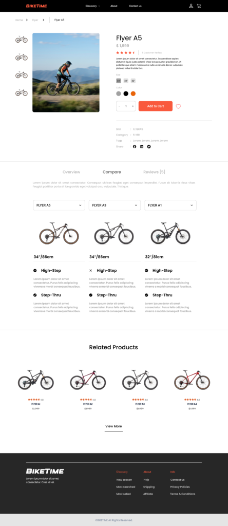
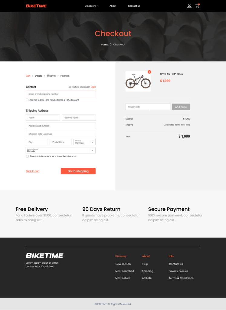
On top of that, I’ve done the second round of high fidelity design
and find several areas to work on:
- It is better to add the price comparison when doing that, because many users are largely motivated by the price. If adding price in the comparison function, it will be much easier for users to make the decision
- It would be even better to change the direction for information display and confirmation. Because most of the users are right-handed so it would be more convenient to do that.
- It’s better to change that to scene/human pictures, otherwise people are less engaged with the pictures, and will be less likely to check out.
Final Version

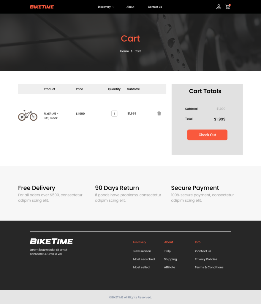




- Reflection and Learning
Further iteration
I would like to make further iteration based on further user researcher. It will be more likely to launch a user friendly emerence website with larger research base and more interviews with target users.
Challenge
The biggest challenge with this project is time constraint. I only get two weeks in total to complete the whole process from brand designing to high fideity test. In my next steps, I would like to further work on testing to optimize the function and the design for bike time.